
posted 26th March 2026
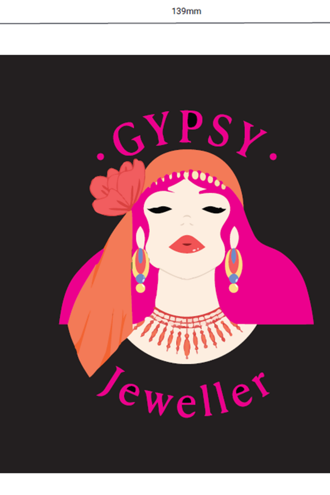
So trying to get the logo onto packaging is not as straight forward as you might think It would be. Sadly.
As I've decided to use Black boxes, the gold foil printed logo needed to be adapted, as my logo has so much black in it. Therefore I've had to get the designer at Tiny Box company to adjust it so that its in an outline form. we are now on our 3rd draft. as the first two were just not quite right.
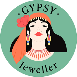
The first draft for the digital print (coloured logo option) was a bit too punk for me. the second option much better. I'm not particularly a fan of brightly coloured dyed hair, someone once told me (obviously just there opinion) that people who dye their hair a very bright colour often have narcissism and well interesting, maybe would indicate a massive rejection of self.
Anyhoooo, the first dig. print I didn't like they have kindly done as second one shown here which I do like, thankfully! (for them and me).
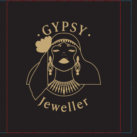
The first draft on the foil image had no iris's and well looked a bit demonic...which was not really the look i'm going for, funnily enough. This one i think the iris's are too small and there is no gap in the mouth which there is in my logo, so again that's going to be hopefully corrected.